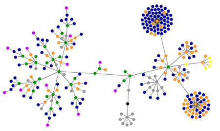
‘Marking time’ as a diagram
My sincere thanks to Marcel Salathe for his websites as graphs applet. I used it to make this beautiful diagram of the HTML tags within the Marking time index page.
The left side of the diagram represents the main content of the page—six blog posts, each made up of a cluster of links and images contained in divs.
The right side represents the right column of the page, with a dense cluster of blue dots (top-right) to signify the monthly archive links. The other dense cluster of blue and orange dots (bottom-right) signifies the subject archive links. The little cluster of yellow dots (far right) signifies the search form.

blue: links (the A tag)
red: table tags - none on this page
green: DIV tags
violet: images (the IMG tag)
yellow: forms (FORM, INPUT, TEXTAREA, SELECT and OPTION tags)
orange: linebreaks and blockquotes (BR, P, and BLOCKQUOTE tags)
black: the HTML tag, the root node
gray: all other tags