Web display cases
I’m a museum junkie. I love being around things that speak to me. It’s my pleasure to look at them closely, to meet them one-to-one.
I even do it in a virtual way, through web sites that display artefacts. Let’s call them web display cases.
I know most people don’t read in a sustained way on the web. Web surfers click from page to page, furtively scanning — not a good way to connect with anything subtle or profound.
But there are times when I do read a web site closely. I need quiet, a good screen, a fast connection, an engaging subject, a receptive state of mind...
...and good information architecture. Here are three cases to look into:
Do you remember, when
First, let’s see the state of the art. It comes from the US Holocaust Memorial Museum. This site is not large or flashy, but it is effective.
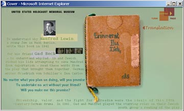
Do you remember, when is the title of the exhibition. It’s also (in German) the title of the central artefact on display—a handmade booklet given by one young man to another. The contents of the little book are shown in graphic images on the screen. You can page through the book, read the hand written German text and see the naive drawings.
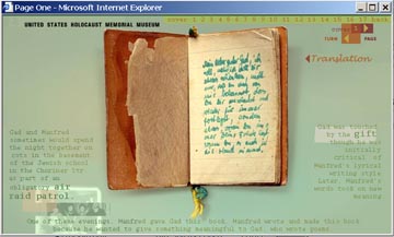
Around the book are pieces of explanatory text and images. Look at the screen shot above. Near the top right is the word translation—pass the mouse pointer over it, and English text is overlaid on the German.
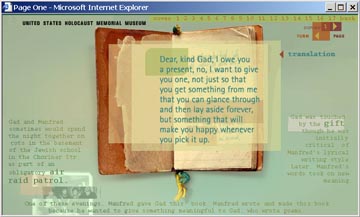
Parts of the screen images are clickable links that open other windows of text, illustrations, animations, audio files and transcripts.
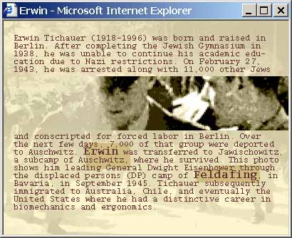
Above is a window of supplementary information. See the words Erwin and Feldafing—these are links to yet more. There is a wonderful richness of information here. You can choose to pass by, or dig deeper.
Do you remember, when has been nominated for the best of the web awards at the Museums and the web 2001 conference. If I was one of the judges, I’d give it a high score.
If you are interested in a more technical critique, I also recommend the review of the site at creativepro.com.
Oscar sketchbook
Second, a subject from the National Museum of Australia. It is also about a hand-made book. I saw this site before I saw Do you remember, when. I thought it was good, but now, having seen what can be done, I am less satisfied.
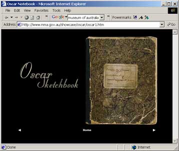
The Oskar sketchbook is a book of sketches made in 1898 by a young Aboriginal man from the Palmer River in north Queensland. Oskar’s drawings record remembered scenes of tribal life and interactions with the European invaders of his country.
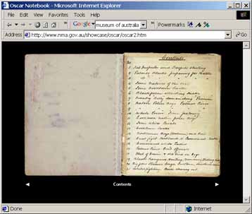
Oskar’s white boss gave him the book and encouraged him to draw, and later added an index at the front with brief descriptions of the subjects (shown above).
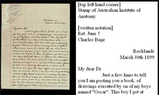
The boss sent the book to a friend, along with a letter explaining its background. The book, and the letter, survived and are in the NMA collection. The web site displays the original letter and a text transcription. There is also a short statement of the significance of the item, but (unlike Do you remember, when) there is no help to put it in an historical context.
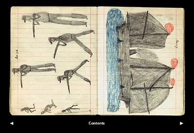
Each pair of facing pages is shown as a single image. Clickable arrows take the display from page to page. Clicking the contents link takes you to the index, but the drawings disappear. If you remember you had been looking at page 26, you could see that this represents Dispersing usual way, some good shooting; the opposite page is Another Cooktown Steamer.
The navigation scheme is clunky, and the background information that might help you connect with the book just isn’t here. These two pages prompt questions: about forced dispersal of Aborigines, the role of Aboriginal troopers in this, about the development of the port of Cooktown. The book looks interesting, but ends up inscrutable.
My report? Could try harder.
Revealing things
Third and last, a project at the cutting edge. It’s a working model, a proof-of-concept, from the Smithsonian Institution.
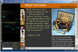
The Revealing things web site is a prototype for the Smithsonian without walls project. It is an experiment in selecting and presenting groups of objects in response to a user’s interests. You can use sliders to vary the importance of different factors (theme, era, object, number) in making a selection. You can enter text search terms. And, at the core of the system, you can explore myriad interconnections between ideas by navigating a dynamic diagram.
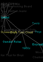
The diagram of connections is built with a Java application called ThinkMap (I’d seen this before, used in the experimental visual thesaurus). In Revealing things, you can follow connections—the boy’s tool chest on display is connected with ideas of tools, toys, enjoyable, 1900s, gender roles, useful, and each of these ideas has a web of other ideas connected to it. A click on one of these terms in the diagram brings it to the centre, and shows links out to other ideas. You can navigate through this constellation of notions and, for each state of the display, there will be a column of thumbnail images to represent a cluster of objects — a click on one of these will show the object in the window on the right.
I won’t try to describe how it all works, just encourage you to look.
Once again, there is a review of this site on creativepro.com...